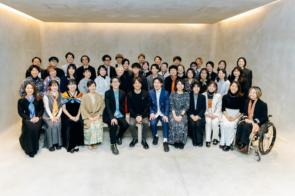
*This article has been re-edited from the content discussed at the employee presentation of the new logo held in March 2024.
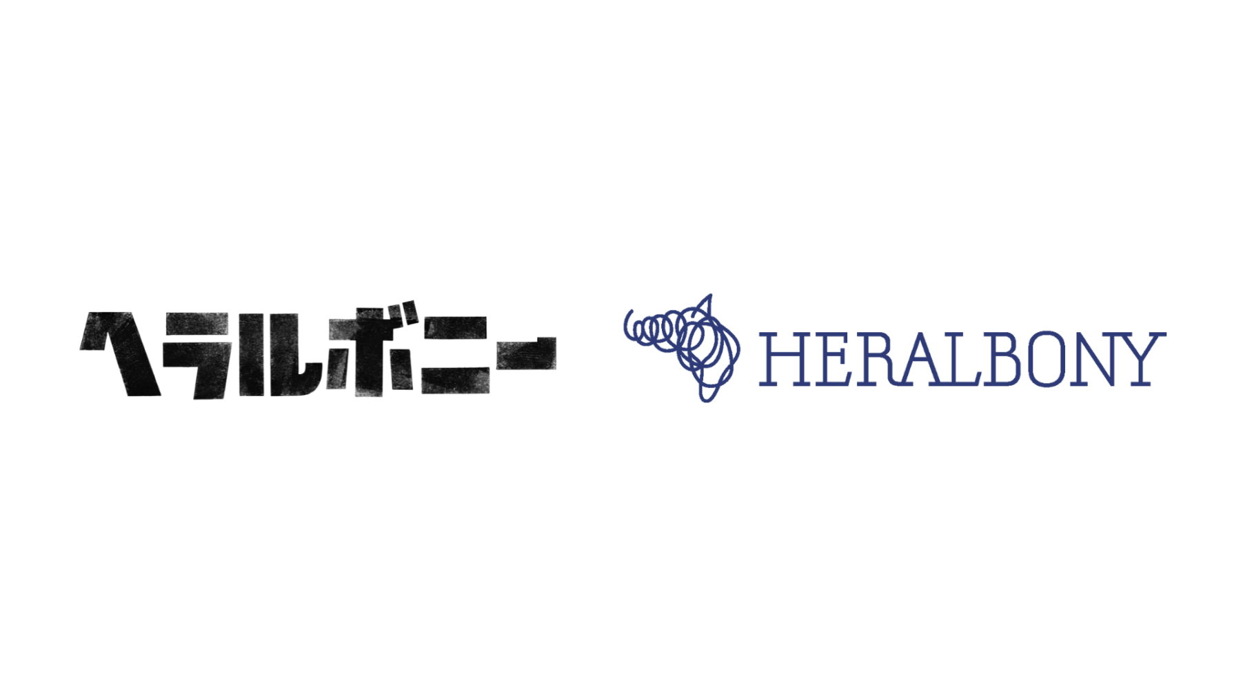
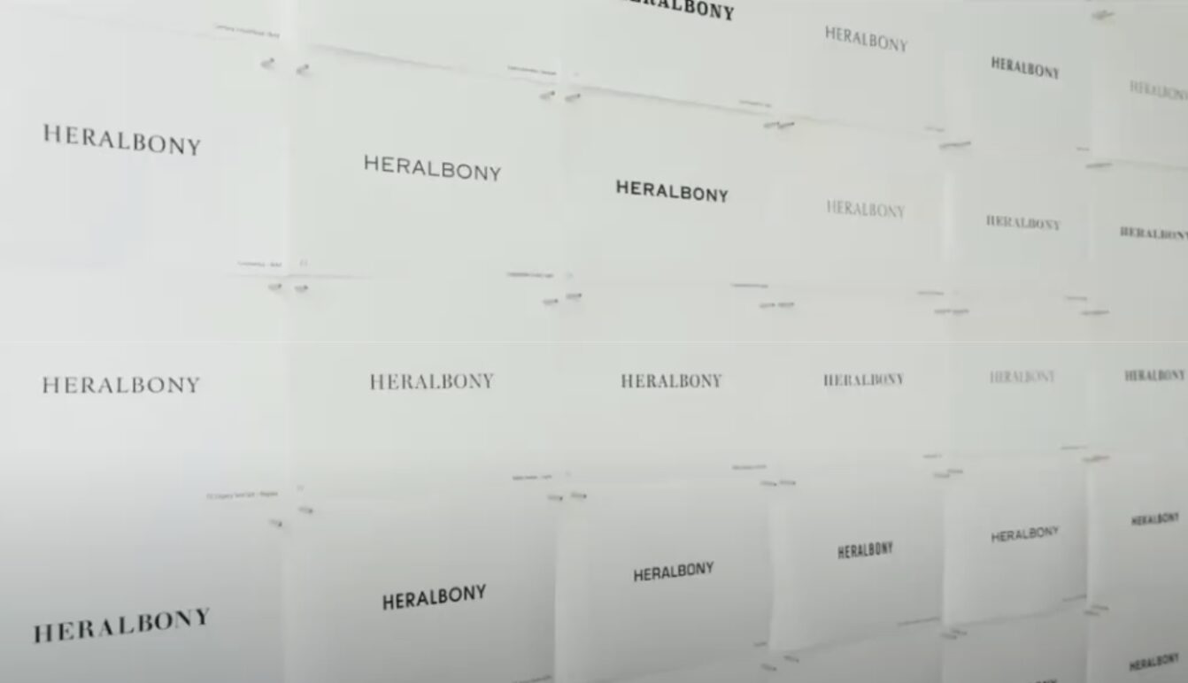
On April 23, 2024, the logo of HERALBONY Corporation was reborn.
“To a society where 8 billion ISAI* can exist as they are.” With the reborn logo, HERALBONY sets sail for new challenges aimed at the world.
The traditional logo, beloved since the company’s founding, had two versions tailored to specific roles: a corporate logo in bold Katakana and a brand logo for “HERALBONY,” consisting of a horse-like silhouette and English letters.
The rebranding project to unify these two logos into a single worldview began a year ago. Manabu Mizuno, representative of the Good Design Company and creative director, created the new face of HERALBONY.
Mizuno has handled a wide range of designs that touch our daily lives, from branding for Nakagawa Masashichi Shoten, Kayanoya, Oisix, Kumamon, and NTT DOCOMO’s “iD,” to art direction for the National Art Center’s “Van Gogh Exhibition” and the Mori Art Museum’s “Le Corbusier Exhibition.”
“Bold and authentic.”
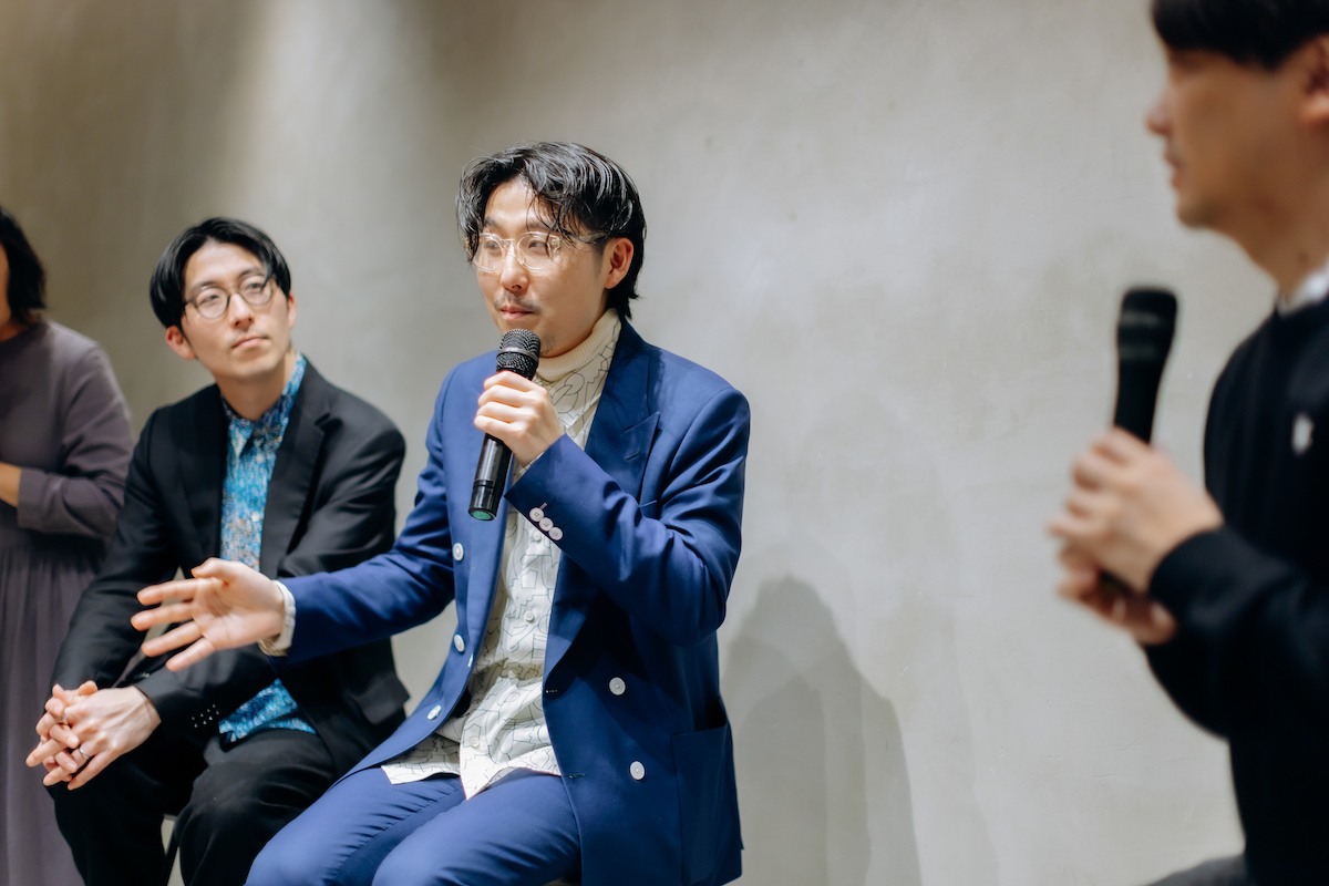
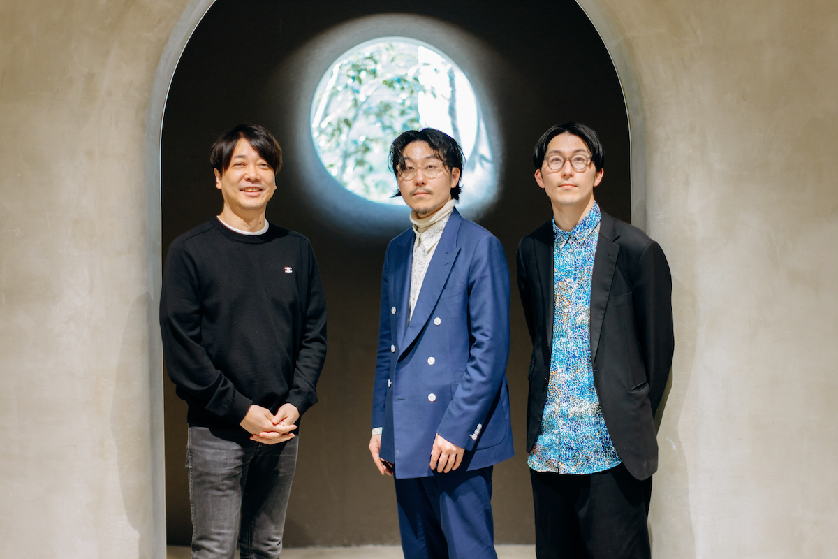
These words expressed by Mizuno encapsulate what is necessary for HERALBONY moving forward: the meaning imbued in the new logo and the vision of becoming a cultural company that endures for a century. Mizuno and HERALBONY’s co-CEOs, Takaya Matsuda and Fumito Matsuda, discuss the thoughts and process behind creating this guiding logo for the future.
To France, Paris, and Cultivating a Legacy Over a Century
Takaya: HERALBONY is often said to be doing “good things.” However, as we mark our fifth year since inception and look forward to the next 10, 50, and even 100 years, creating “good products” becomes increasingly important to evolve into a culture.
Imagine someone choosing a Christmas present, hesitating whether to buy from HERALBONY or another big storefront brand. It’s crucial for HERALBONY to be part of such real-life choices. If we can achieve this, we can genuinely deliver positive news to our mother, brother, and those involved in disability welfare.
Therefore, we at HERALBONY must quickly move beyond just being appreciated for “art by people with disabilities” and transform into a leading company that changes the norms of disability welfare and creates a new culture. We are confident that if our revenue increases a hundredfold, society will improve a hundredfold. As such, our company aims not only to sell products but also to deliver our philosophy.
This year, we want to expand internationally, starting with Paris, France. At this critical moment for international expansion, it was essential to unify our Katakana “ヘラルボニー” and the English “HERALBONY” into a logo that conveys a strong message.
Fumito: We are serious about delivering ISAI to the world. To declare our readiness, we asked Mr. Mizuno to design our logo. He has created an excellent logo that serves as a guidepost, embodying the worldview suitable for a cultural enterprise that will last a century.
Takaya: In 2018, we twins founded HERALBONY with a lifelong commitment to creating a society where our brother with autism could be happy. As time has passed, blessed with the support of many, we now dedicate our lives to creating a society where people with intellectual disabilities and those around them can be happy. For this, HERALBONY should not only be a brand that challenges the world but also a movement that creates a new culture of “beauty” and “excellence” amidst the discrimination and negative perceptions surrounding disability welfare.
We aim to create instantly recognizable, excellent “products.” With this attitude, we will rigorously embody the essence of Mr. Mizuno’s logo in everything we do.
"Do You Know This?" "It's Kind of Cool, Isn't It?" The Brand Making Statements
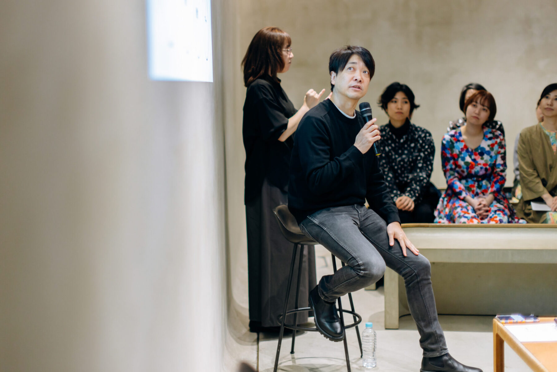
Mizuno: Right now, various perspectives are being updated globally, aren’t they? With the proliferation of social media, every individual’s voice and actions are significantly altering the world. HERALBONY is one of the organizations that can change this world’s norms.
As many of you know, HERALBONY currently has two logos, one in Katakana and one in English. Both logos, which have carried various sentiments until now, are fantastic. Moreover, in considering enhancing the company further, we thought about what kind of logo would accelerate HERALBONY’s actions thus far and continue to significantly impact society.
Looking at HERALBONY’s current logos, we felt their brightness, lightness, energy, and powerful sense of transformation and challenge. And, of course, they also embody ‘art.’
After listening to the Matsuda brothers talk about their future vision and the world they aspire to create, I reflected on what words would best describe HERALBONY going forward. The phrases that came to mind were “That’s cool,” “Aspirational,” “Do you know this?” and “It’s kind of cool, isn’t it?”
I thought, why not aim for HERALBONY to be a brand that even people who don’t know it or its special background can look at and think, “That’s cool!” from a neutral perspective??
A Journey Through Typography and Art with HERALBONY
Mizuno: Typography in logo design may seem niche, but it’s essential. We discussed serif and sans-serif fonts in the process. Serif fonts have small decorative lines at the end of strokes, hence the name, while sans-serif, derived from the French word for without, lacks these lines. Serif fonts are typically used by traditional brands, while sans-serif fonts are favored by modern or technology-related brands.
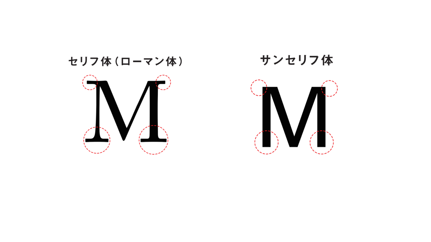
For HERALBONY, the choice between serif and sans-serif could go either way. As I delved deeper, I thought, why not focus more on “art”?
HERALBONY as "Contemporary Art"
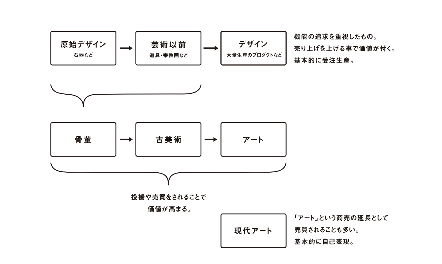
Mizuno: Let’s briefly touch on art history. Initially, art was functional. For example, the Habsburg family’s portraits, such as Margarita’s, served practical purposes like modern matchmaking photos, not created merely for aesthetic enjoyment. Most traditional art was not made solely for exhibition but had practical functions, such as religious paintings or floral still lives.
A significant shift occurred in 1766 when Christie’s, one of the largest auction houses, was established in London. This marked the beginning of art transitioning from functional pieces to valued antiquities with historical significance.
By the 1800s, art had moved from being valued as antiquities to modern art, and it was appreciated for innovations like Monet’s Impressionism and Picasso’s Cubism. This era also saw Marcel Duchamp’s Readymade and Andy Warhol’s mass-produced artworks, steering contemporary art direction.
In this context, HERALBONY’s creations possess individual artistic allure and resonate with contemporary art. The activities of turning spontaneous artistic impulses into products or projects feel akin to the invention of contemporary art.
Furthermore, HERALBONY’s business model enables people with disabilities to earn an income and significantly alter societal structures, which can also be seen as purpose-driven art. In essence, HERALBONY employs contemporary art methods to achieve functional goals. It’s a complex area to navigate, but it’s where we find ourselves today.
Embodying Confidence and Authenticity in HERALBONY's New Typeface
Mizuno: I struggled to decide as we typed out characters and printed them to see which looked best. After comparing numerous typefaces, I realized HERALBONY’s logo must embody boldness and authenticity. Given the brand’s current level of attention, being bold and authentic seemed essential. And if we were to reflect an “art” that predates modern interpretations, a historical serif typeface seemed appropriate. Thus, we developed this new typeface.
This original typeface for HERALBONY was informed by various studied fonts, including Garamond, used in the letters at the Louvre Museum. Opened shortly after the French Revolution, the Louvre was one of the first museums in the world. Considering such a rich history, it felt right to draw inspiration from Garamond for HERALBONY’s typography.
From Iwate to the World: The Vision of Three Brothers Embodied in HERALBONY's New Mark
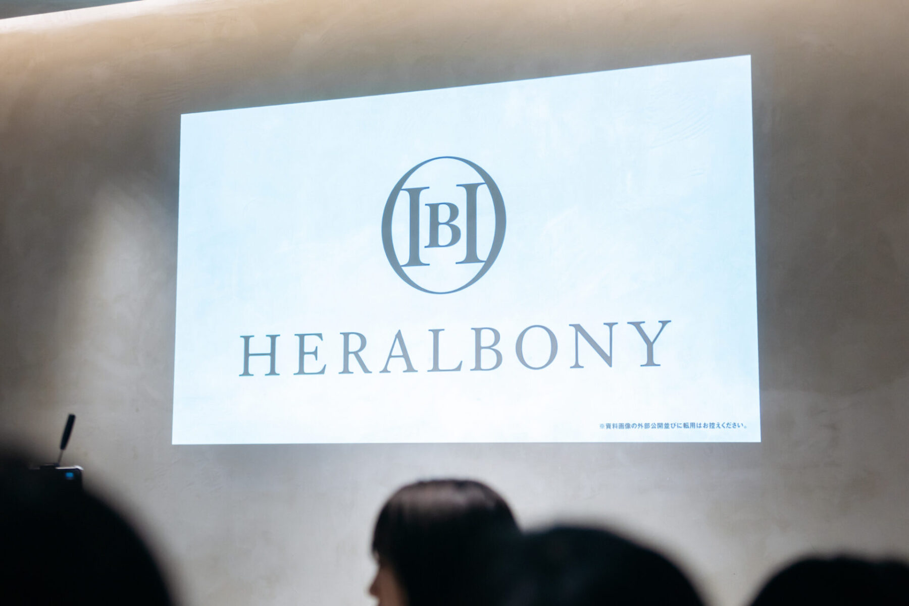
Mizuno: Besides the typeface, we thought creating a mark that could be used as a subtle yet significant touch on clothing tags and other small spaces was essential. It needed to be evident regardless of its placement or size and more than just a symbol—it had to convey our intent. We began by experimenting with various combinations of “H” and “B,” the initials of HERALBONY.
Together, we brainstormed and sketched many ideas by hand, gradually deciding on a direction. We thought, “This isn’t bad. Actually, it’s quite good.” We considered making it more classic or more user-friendly, and from these various ideas, we eventually created a mark that encircles the “H” and “B” with a circle..
As we developed it, I felt the circle could embody multiple meanings. It could be seen not just as the alphabet letter “O” but also as a geometric”◯.” This symbol represents the circle of society coming together, the Japanese concept of harmony (“wa”), the globe, and the ensō (a Zen painting symbolizing the world).
の-愛(I)と-アイデア(IDEA)で-岩手県(IWATE)から-異彩(ISAI)を、放て。-そして-未来を切り拓こう(OPEN)-やがて-世界(◯)を変えていこう。.png)
In summary, the love and ideas of the two brothers who lead the company, originating from Iwate* and aiming to change the world, are encapsulated in this design. It may seem a bit far-fetched, but it has become a meaningful and expressive representation of their vision.
Advancing into the World with a New Symbol: HERALBONY's Journey Forward
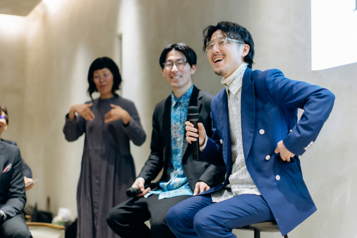
Takaya: Thank you for granting us this excellent logo. I am genuinely delighted. May I ask, as a world-renowned creative director with many requests, why did you choose to take on HERALBONY’s project?
Mizuno: I’ve been following HERALBONY for a while. I imagined you all must be having fun despite the challenges, and I admired that. I have little desire for fame or to create solely for my acclaim. I prefer working behind the scenes and am not interested in the limelight or making much money. Watching HERALBONY do good things and connect with the community as a movement was something I envied. That’s why I respect you, and although our fields are different, I’ve always drawn inspiration from you. I never thought I’d get such an opportunity.
Fumito: It’s been an exciting and nerve-wracking experience, almost like a dream. Could you share any messages you have for each employee at HERALBONY?
Mizuno: As you continue to accompany people with disabilities, I think it would be wonderful if HERALBONY could aspire to grow into a global brand on par with the world’s leading names. When designing the logo, I focused on the outcomes for the company. Another critical aspect of the logo is its representation of the brand’s origins and policy. The close relationship between you two, the love present, and including your brother Shota, is captured within the mark. I hope this logo helps improve society through your work.
Fumito: This logo is a precious symbol for us, marking our path forward together. As a company and a brand, we aim to create a culture that radiates ISAI. We are grateful for a strong and beautiful logo that enables us to declare our intentions to the world as a company that will continue for a hundred years. Thank you, Mr. Mizuno.
Takaya: Let’s work towards a future where the actions and words of people with severe intellectual disability, like my brother, are affirmed in society. Art should not be the only option for people with intellectual disability. Let’s create an enterprise where working with people with disabilities is the norm.
******
Iwate: A prefecture in the Tohoku region, Japan, where HERALBONY’s head office is located. Birthplace of the co-CEO Matsuda brothers.
ISAI: HERALBONY defines ISAI as exceptional talents that every individual has. The word literally means “different colors” in Japanese.
******
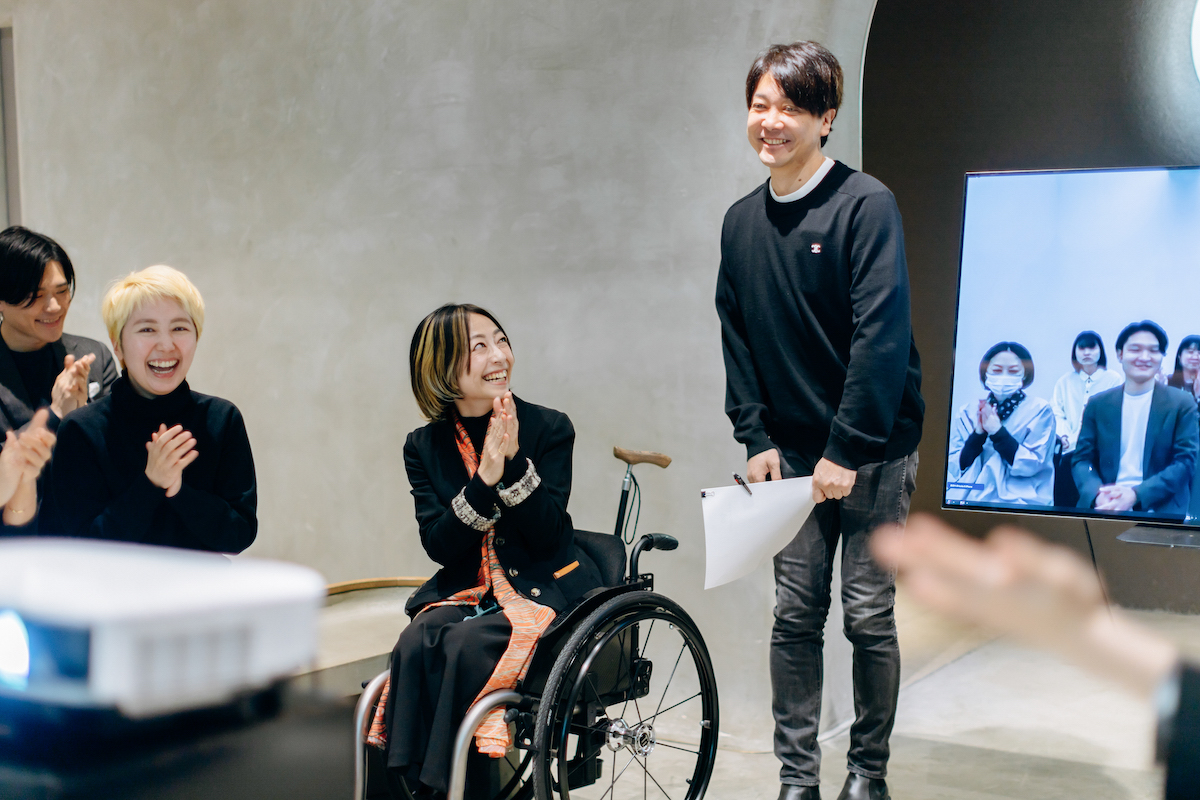
March 11, 2024
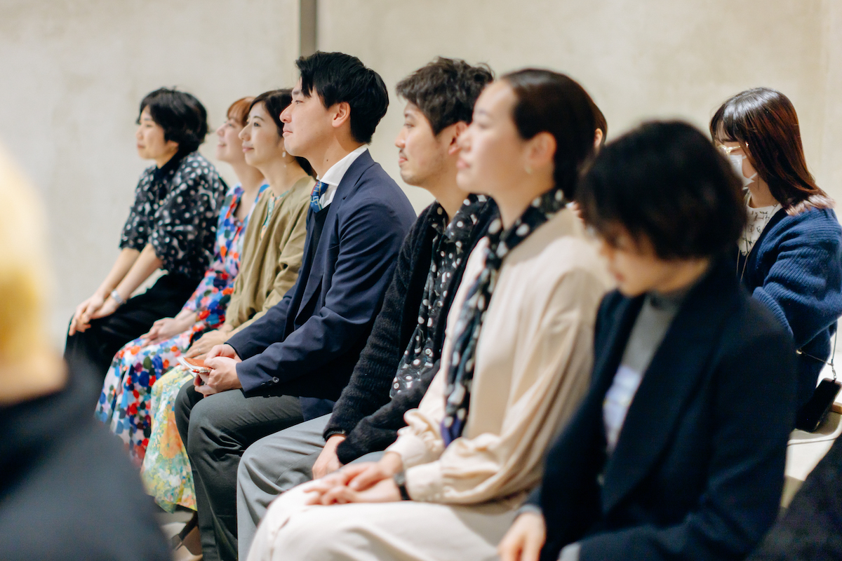
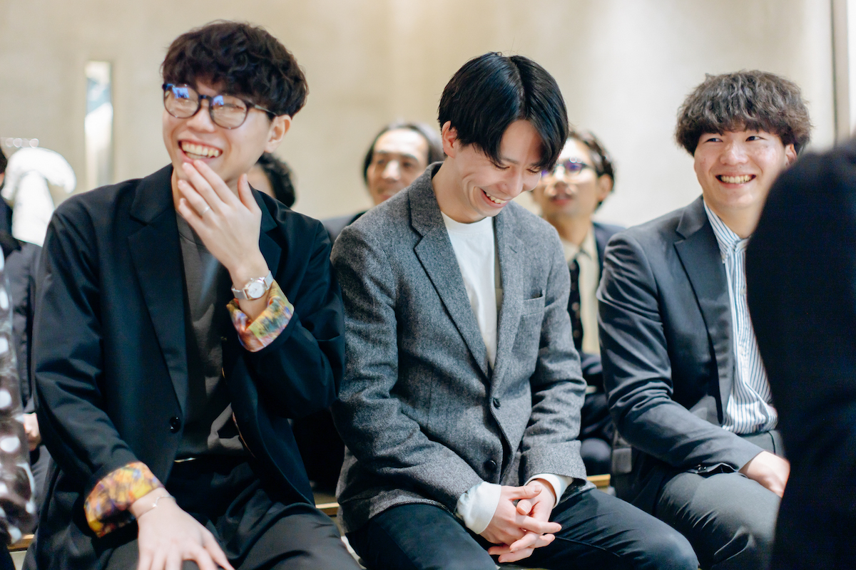
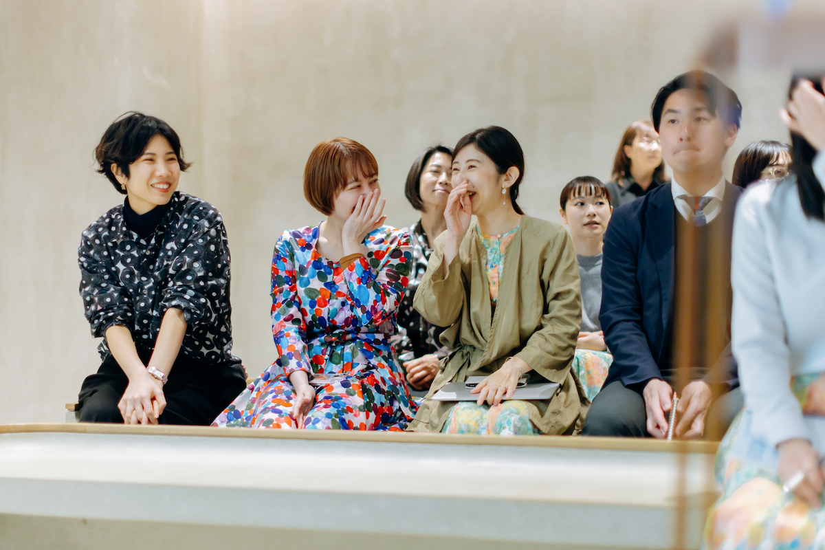
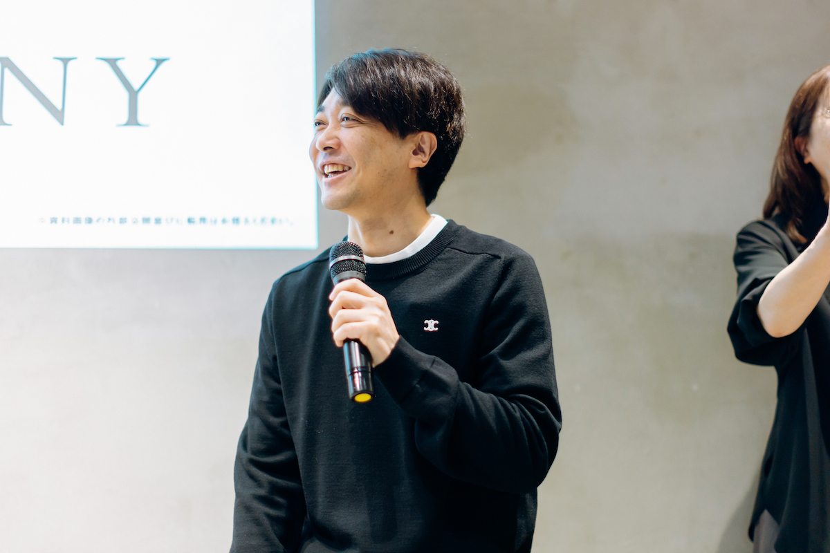
Members of HERALBONY gathered at IWAI OMOTESANDO to discuss the future they envision and the sentiments embodied in their new logo alongside the renowned creative director, Manabu Mizuno. The event also featured remote participation from members based in Iwate.
The venue IWAI OMOTESANDO, where the meeting took place, is known for its concept of being “A place to celebrate life and milestones,” making it a fitting venue for such a new beginning.
Written by: Tomoyo Akasaka
Photography by: Mika Hashimoto
Edited by: Shizuka Ono (HERALBONY)
Venue: IWAI Omotesando